 In 2004 SABMiller announced the launch of a new corporate brand and corporate identity for The South African Breweries. While acknowledging that the company brand was one of its greatest assets, which research had shown was more familiar to consumers than many of the product brands it manufactured, SAB decided to update and rethink what its logo represented.
Just the previous year, South Africans had voted SAB their favourite brand in a Sunday Times survey. So why introduce change now?

A concerted research process revealed that the brand held a beloved and iconic place in the public imagination – but also that consumers struggled to understand the place of SAB in the company hierarchy, questioning whether the company was still South African, and uncertain whether it was now called SABMiller or SAB.
In light of this study – as well as all the recent growth and global acquisitions – SABMiller felt it was time to reassert the South African-ness at the core of its company identity, and relink the brand to the country of its birth.

Since the 1980s, much of the company’s corporate advertising had been focused on SAB’s place in South African society, first taking up the challenge of responsible messaging on alcohol and later promoting the country’s changing social landscape.
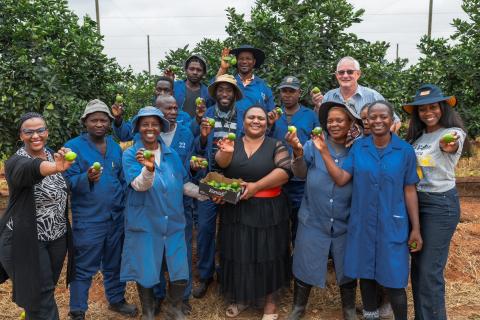
To coincide with the launch of the new company logo, the marketing campaign included a TV advert featuring 800 SAB employees singing and highlighting the company’s achievements, equity initiatives and social resourcefulness (such as the building of water pumps powered by children’s roundabouts, which pumped water into hundreds of rural communities).
The response to the ad was powerful. It tapped into a South African pride that reflected the mood of the nation, celebrating a new era of optimism. People felt that SAB was living up to its promises – investing in its people and their working conditions, as well as the country as a whole.
![]()
The new corporate identity of 2004 sought to be more contemporary, but still instantly recognisable as the SAB loved by so many. Retaining the corporate colours (but losing the beer glass) the clean design includes a ring that is either suggestive of a glass rim or the residue mark left by a glass. The icon also suggests movement, in keeping with a company that is constantly evolving.
The name SAB was kept – emphasising the company’s South African pride – but spelled out to stress its nationality.

Changing the SAB mark required massive logistical co-ordination, and replacing the livery on all the trucks, breweries and depots proved to be an enormous exercise. It was a bold and ambitious move, but ultimately a successful one – proving once again that SAB can embrace change and evolve without losing its rich heritage and valued traditions.

In 2004 SABMiller announced the launch of a new corporate brand and corporate identity for The South African Breweries. While acknowledging that the company brand was one of its greatest assets, which research had shown was more familiar to consumers than many of the product brands it manufactured, SAB decided to update and rethink what its logo represented.
Just the previous year, South Africans had voted SAB their favourite brand in a Sunday Times survey. So why introduce change now?

A concerted research process revealed that the brand held a beloved and iconic place in the public imagination – but also that consumers struggled to understand the place of SAB in the company hierarchy, questioning whether the company was still South African, and uncertain whether it was now called SABMiller or SAB.
In light of this study – as well as all the recent growth and global acquisitions – SABMiller felt it was time to reassert the South African-ness at the core of its company identity, and relink the brand to the country of its birth.

Since the 1980s, much of the company’s corporate advertising had been focused on SAB’s place in South African society, first taking up the challenge of responsible messaging on alcohol and later promoting the country’s changing social landscape.
To coincide with the launch of the new company logo, the marketing campaign included a TV advert featuring 800 SAB employees singing and highlighting the company’s achievements, equity initiatives and social resourcefulness (such as the building of water pumps powered by children’s roundabouts, which pumped water into hundreds of rural communities).
The response to the ad was powerful. It tapped into a South African pride that reflected the mood of the nation, celebrating a new era of optimism. People felt that SAB was living up to its promises – investing in its people and their working conditions, as well as the country as a whole.
![]()
The new corporate identity of 2004 sought to be more contemporary, but still instantly recognisable as the SAB loved by so many. Retaining the corporate colours (but losing the beer glass) the clean design includes a ring that is either suggestive of a glass rim or the residue mark left by a glass. The icon also suggests movement, in keeping with a company that is constantly evolving.<br/
The name SAB was kept – emphasising the company’s South African pride – but spelled out to stress its nationality.

Changing the SAB mark required massive logistical co-ordination, and replacing the livery on all the trucks, breweries and depots proved to be an enormous exercise. It was a bold and ambitious move, but ultimately a successful one – proving once again that SAB can embrace change and evolve without losing its rich heritage and valued traditions.